Brand, print, menu, and social design / Dallas-Fort Worth
Seven briefs, and how each one was answered.
Every piece below starts with the brief and its constraints, then shows the decisions that met them. Five are self-directed concept projects and are labeled that way. Two are real work: a co-branded trade flyer and a pre-order flyer for my own store.
A roaster’s identity that had to work on a bag, a cup, and a card on day one
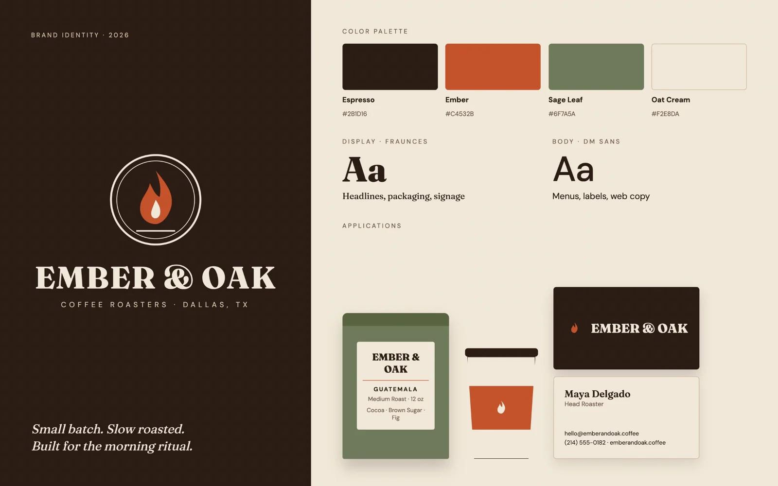
A small-batch coffee roaster was opening its first Dallas storefront. The identity had to feel warm and handcrafted without looking rustic or dated, and it had to work on retail bags, cups, signage, and business cards from the first day.
Decisions
Select a numbered point on the piece, or a line here.
The mark is a single flame inside a double ring. It nods to the roasting process and still reads as a coffee bean when it shrinks to icon size.
Fraunces, a soft serif with enough character to feel made by hand without tipping into rustic.
Espresso anchors the system, Ember orange handles accents, Sage Leaf goes on packaging, and Oat Cream is the neutral ground.
Fraunces carries headlines, packaging, and signage. DM Sans handles menus, labels, and web copy.
A retail bag label, a cup sleeve, and a two-sided business card show the system working on real objects.
Constraints
- Warm and handcrafted, not rustic or dated
- One system across bags, cups, signage, and cards
- A mark that survives icon size
Palette
Type
Details
- Format
- Brand sheet, 1600 x 1000 px
- Delivered
- Primary logo, icon mark, four-color palette with hex codes, type pairing, retail bag label, cup sleeve, two-sided business card
- Tools
- Illustrator for the mark, InDesign for the brand sheet
A poster that had to read from across the street and still work in a story
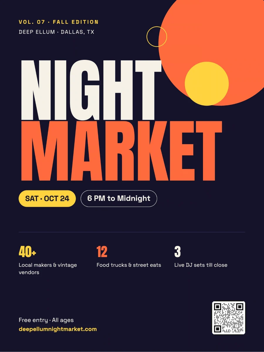
A seasonal outdoor market of local makers, food trucks, and DJs in Dallas’s Deep Ellum arts district. The poster goes on telephone poles and coffee shop boards, then gets reposted to Instagram, so it had to survive both distances and match the neighborhood’s music and street-art energy.
Decisions
Select a numbered point on the piece, or a line here.
The event name runs the full width of the poster in Anton, a condensed display face, so it reads at a glance from the sidewalk.
Overlapping orange and yellow circles suggest string lights and a rising moon against a deep indigo night sky.
Date and time sit in pill shapes directly under the headline.
Three quick numbers, vendors, food trucks, and DJ sets, give people a reason to go.
A QR code at the bottom links to the vendor list. The same layout adapts to an Instagram story and a Facebook event cover.
Constraints
- Stand out on poles, boards, and stories
- Readable from across the street
- Match the neighborhood’s music and street-art energy
Palette
Type
Details
- Format
- Poster, 18 x 24 in
- Delivered
- Print poster, adapted to an Instagram story and a Facebook event cover
- Tools
- Illustrator for the shapes, InDesign for layout and print export
Two brands, four ordering platforms, and one flyer both partners approved
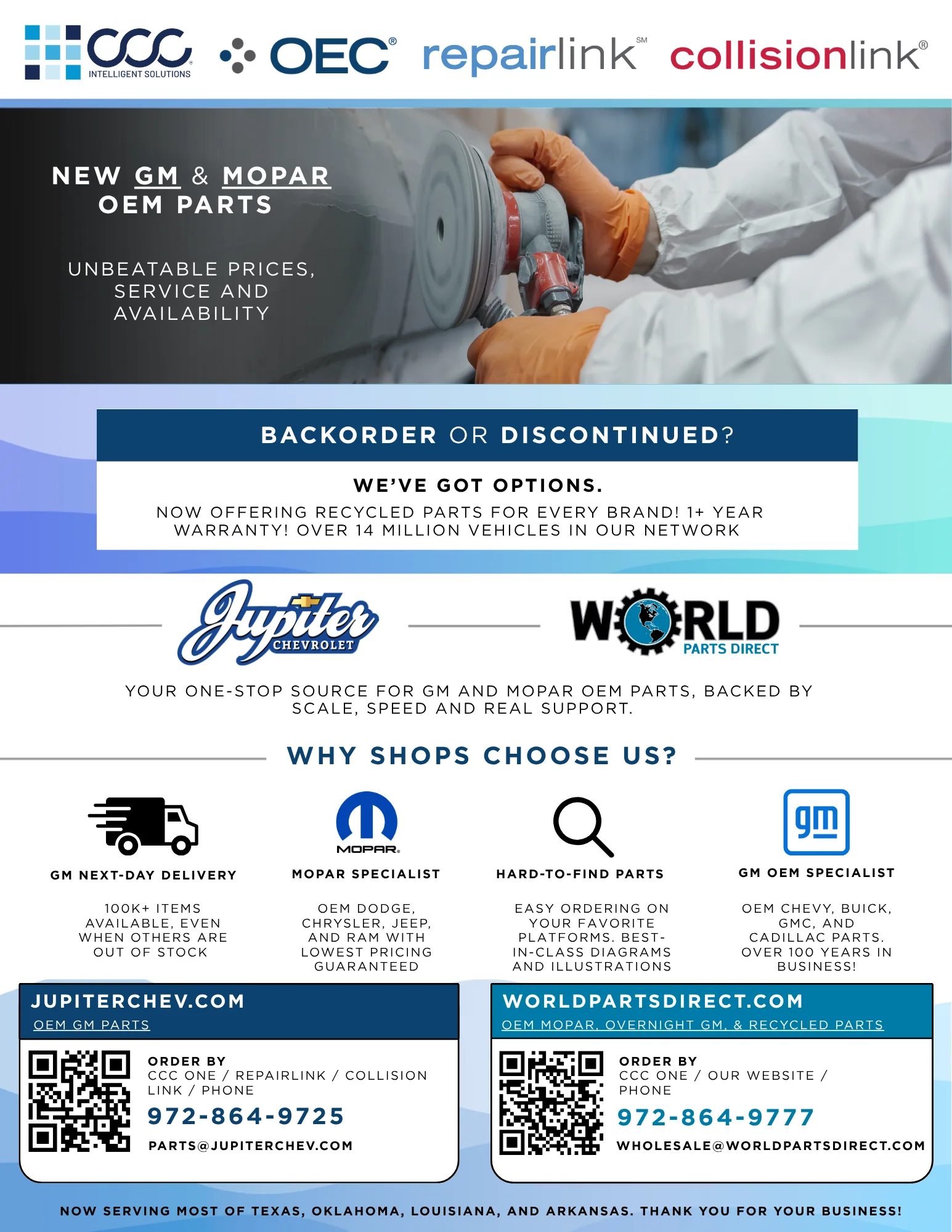
One piece had to sell OEM parts to body shops while carrying two companies’ brands and four ordering platforms. It was a co-branded trade sheet for Jupiter Chevrolet and World Parts Direct, built for parts managers who scan before they read.
Decisions
Select a numbered point on the piece, or a line here.
Led with the platforms shops already order through, CCC ONE, OEC RepairLink, and CollisionLink, so a parts manager sees at a glance that ordering fits their workflow.
Jupiter Chevrolet and World Parts Direct sit side by side at the same size, so neither brand reads as the guest.
The pitch is condensed into four scannable reasons: next-day GM delivery, Mopar specialization, hard-to-find parts, and GM OEM depth.
Each partner gets an equal panel at the bottom with its own site, QR code, phone line, and email.
Constraints
- Two brands carried at equal weight
- Four ordering platforms shown at a glance
- Approved by both the retailer and the partner dealership
Palette
Details
- Role
- Concept, layout, copy, prepress, approval routing
- Format
- Letter size, print-ready, QR-linked to ordering
- Status
- Proofs went through both the retailer and the partner dealership. Feedback was closed from both before release to print.
- Tools
- InDesign, Photoshop, Illustrator
One offer big enough to see from the windshield, three more worth clipping
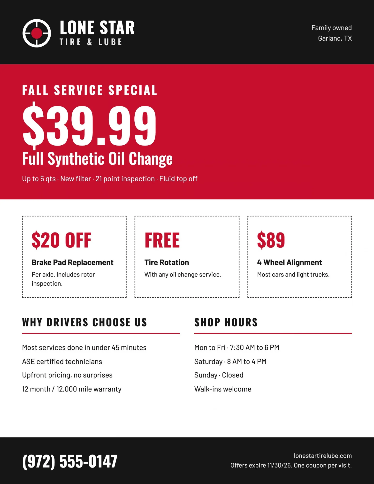
A family-owned auto shop in Garland, competing with national quick-lube chains, wanted fall service traffic from local mailers, counter handouts, and windshield drops. The ask was one clear headline offer plus a few add-on deals, without the cluttered look of a typical auto ad.
Decisions
Select a numbered point on the piece, or a line here.
The $39.99 synthetic oil change sits in a full-width red band, so the lead offer is the first thing anyone sees.
Three dashed-border coupons make the secondary deals feel clippable and redeemable.
A two-column block covers trust points, ASE certified technicians, warranty, and upfront pricing, next to the shop hours.
The phone number closes the page in large type, where a driver ends up looking.
Constraints
- One headline offer, three add-ons
- No cluttered auto-ad look
- Works as a mailer, a handout, and a windshield drop
Palette
Type
Details
- Format
- Flyer, 8.5 x 11 in with bleed
- Delivered
- Print-ready flyer plus a half-page version for direct mail
- Tools
- InDesign for layout, Illustrator for the logo mark
A menu board read from ten feet away, in direct sun, by someone in line
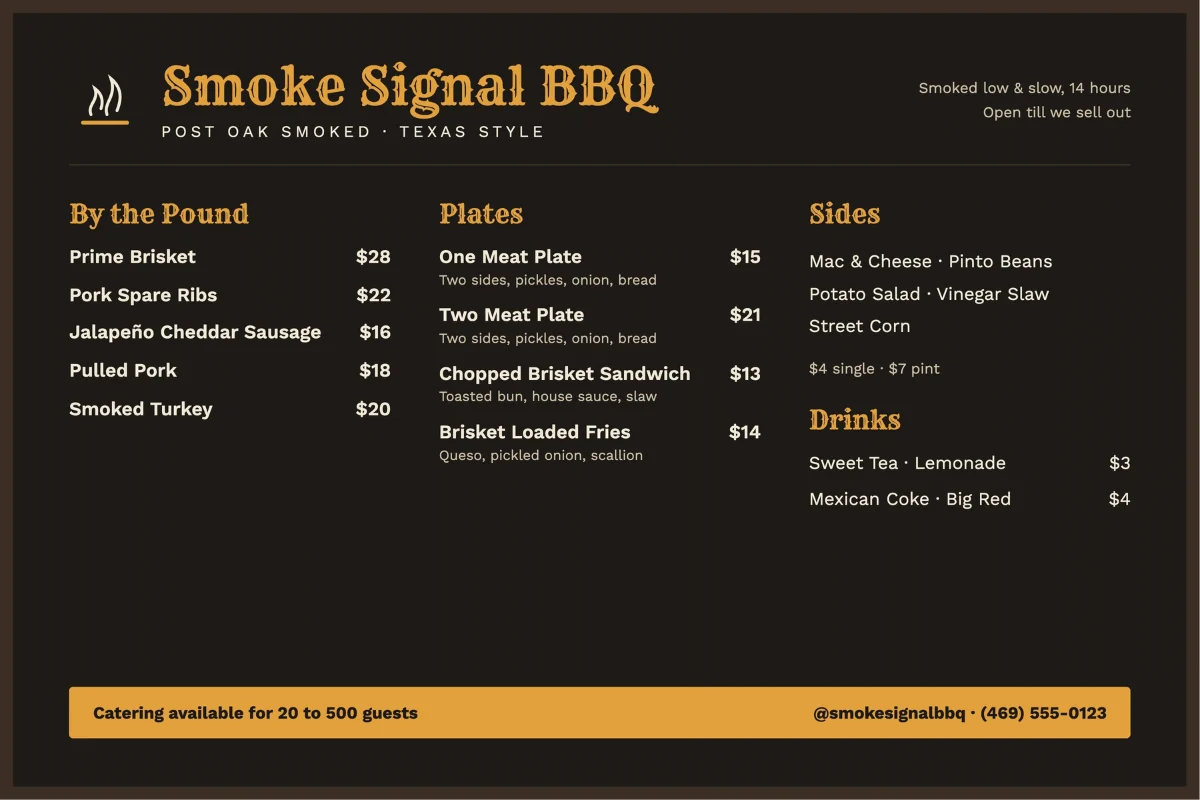
A Texas barbecue truck serving post oak smoked meats at breweries and events around DFW wanted to replace a handwritten chalkboard. The new board had to be scannable by someone still in line, hold up in direct sunlight, and stay legible from six to ten feet.
Decisions
Select a numbered point on the piece, or a line here.
Rye handles the brand name and section headers, which gives the board its Texas character.
Gold headers on a dark charcoal ground hold contrast outdoors, where a light board would blow out in the sun.
Meats by the pound, then plates, then sides and drinks, the way people actually order.
Prices align to the right edge of each column so they can be compared at a glance, without a read.
A gold footer bar promotes catering, the truck’s highest-margin service, in the spot people look at while they decide.
Constraints
- Scannable by someone in line
- Holds up in direct sunlight
- Legible from six to ten feet
Palette
Type
Details
- Format
- Menu board, 36 x 24 in, weatherproof
- Delivered
- Menu board plus a matching social graphic for daily specials
- Tools
- InDesign for layout, Illustrator for the smoke icon
A collector pre-order built around the draw ticket
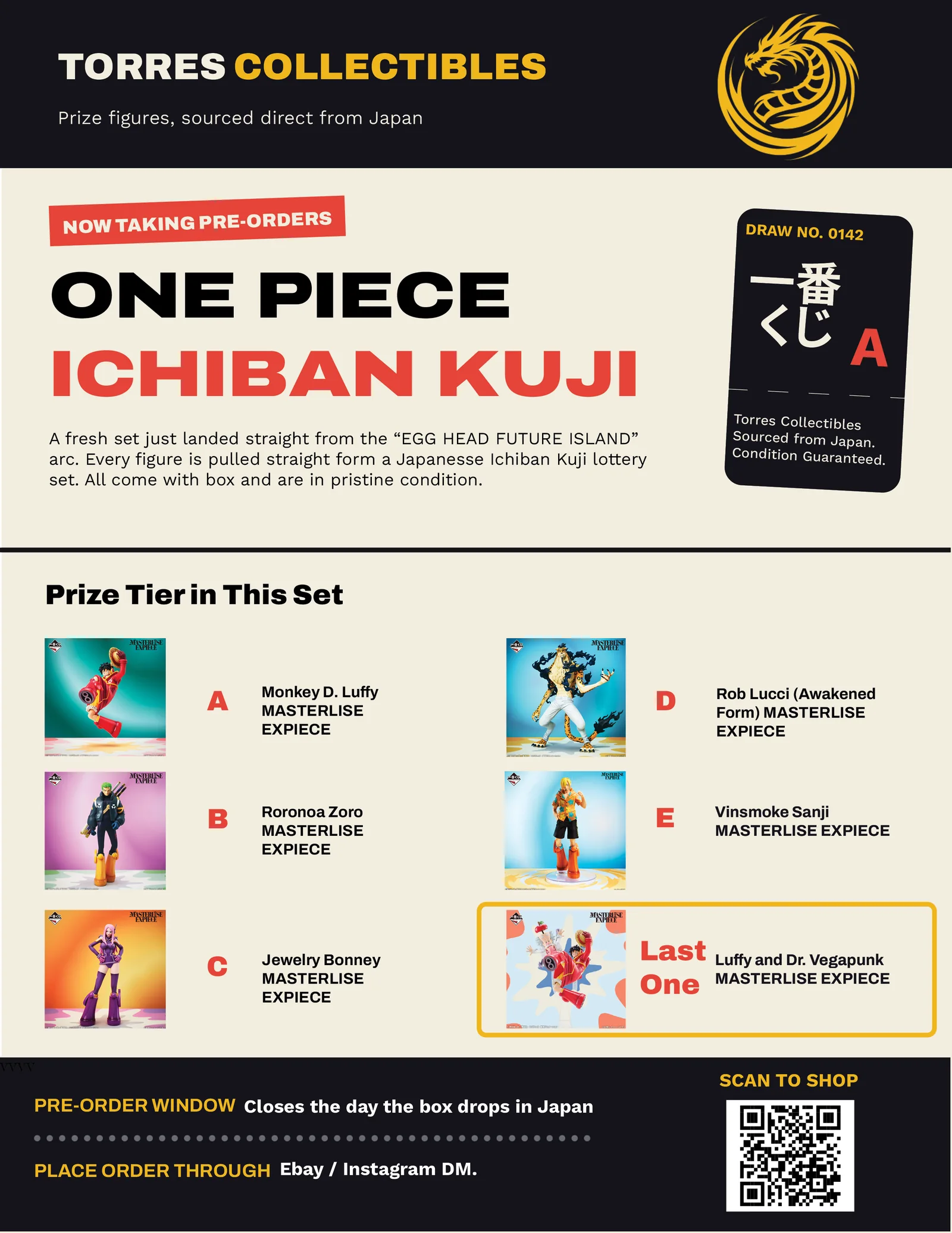
A pre-order flyer for Torres Collectibles, my own anime figure store. It had to sell a Japanese lottery-style figure set to collectors who already know the product better than most retailers do.
Decisions
Select a numbered point on the piece, or a line here.
Recolored the brand mark in Photoshop so the dragon logo holds on the dark header.
The hero is built around a kuji draw ticket, the object collectors associate with the product, instead of a generic sale banner.
The full prize tier, A through E, is laid out because tier is what collectors shop by.
The Last One prize gets its own framed cell, set apart from the lettered tiers.
Closes with the pre-order window and where to order, next to a scan-to-shop QR code.
Constraints
- Collectors already know the product
- The full prize tier has to be visible
- Pre-order window and where to order, stated plainly
Palette
Details
- Format
- Letter size, print-ready, QR code to the shop
- Used for
- Pre-orders at Torres Collectibles on eBay and Instagram
- Tools
- InDesign, Photoshop, Illustrator
A new-student offer that had to stop the scroll without raising its voice
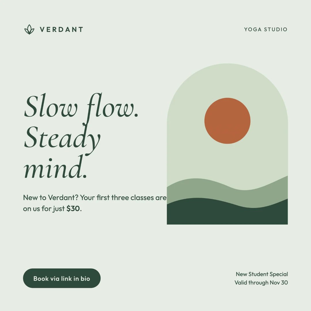
A boutique studio focused on slow flow and restorative classes for beginners wanted to promote a new-student offer, three classes for $30, on Instagram. It needed to feel calm and inviting instead of salesy, and still stop the scroll.
Decisions
Select a numbered point on the piece, or a line here.
A soft sage background and an arch-shaped illustration of a setting sun over rolling hills set the mood before anyone reads a word.
Cormorant Garamond in italics gives the headline an elegant, unhurried tone.
Outfit handles the offer details. The price is the only bold element in the body copy, so the deal is clear without shouting.
A pill-shaped Book via link in bio button gives a direct next step.
Constraints
- Stop the scroll while staying calm
- Stay on a quiet, natural brand
- One offer, one next step
Palette
Type
Details
- Format
- Feed post, 1080 x 1080 px
- Delivered
- Feed post plus story and carousel variations at 1080 x 1920 px
- Tools
- Illustrator for the illustration, Photoshop for export
What the work has in common
Start from where it is seen
A telephone pole, a windshield, a line of customers in the sun, an Instagram feed. Each layout was set for that viewing distance and that moment before anything else.
Put the reading order in the layout
Headline, then date, then a reason to go. Price, then coupons, then trust. Meats, then plates, then sides. The structure follows what the reader does next.
Keep one thing loud
The price on the yoga post, the headline on the poster, the red band on the flyer. Everything else is quieter so the main thing lands.
About
I design print, menu, and social work for small businesses through my freelance practice, which I have run since 2024. I also handled print and promotional design in-house at World Parts Direct, including the co-branded trade flyer above.
I work in Illustrator, InDesign, Photoshop, and Canva. I am happy to walk through the thinking on any piece, or show working files.